This has been fun, I won’t lie to you.
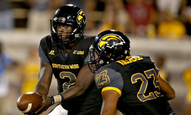
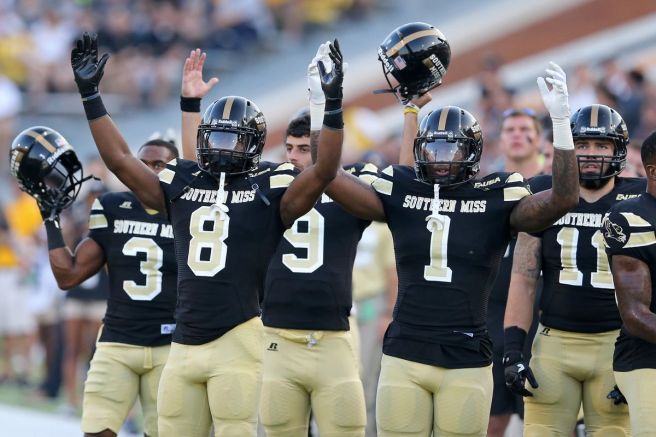
Yesterday, Southern Miss (The University of Southern Mississippi) ran out their new uniform combinations with their new apparel and uniform partner adidas. The football uniforms were, for simplicity sake, not good. So, being the design loving, football loving, uniform loving guy that I am, I simply quote tweeted the tweet I saw in which the only three uniforms available to the public at this point could be seen with my own critical commentary of the design (or lack thereof). In the original tweet, which has now been further clarified, there was what appeared to be three variations (White, Black, and Gold) of practice uniforms. I say they appeared to be practice uniforms because they all shared the same “lack of design” concept that would come with a practice uniform.
Well guys, two of them are practice uniforms. And the gold ones are not, but they don’t look too much different. But we will get into that later.
Then the Golden Eagle Twitter warriors let me have it. They got #MadOnline at me. Even so much as to peruse through this very site here (thanks for the views by the way!) to formulate a tweet where they point out my bad logos and worse type choices. Why? I can only guess it’s because they love their team. Me too, guys. But the undying passion we all share for our schools doesn’t mask that sometimes they flub up and make a bad uniform. And me not liking your schools bad uniform doesn’t mean I now automatically make bad logos and uniforms (because I promise I don’t).
Anyway, let me go ahead and explain why they are bad for you Golden Eagles and fans. And my design friends who know what I mean, please forgive me. I know I’m not supposed to explain design things to non-design people who really only care that their favorite team got some new threads in a different brand name and pattern than the last one, therefore looking “good” by default of being different than before or new.
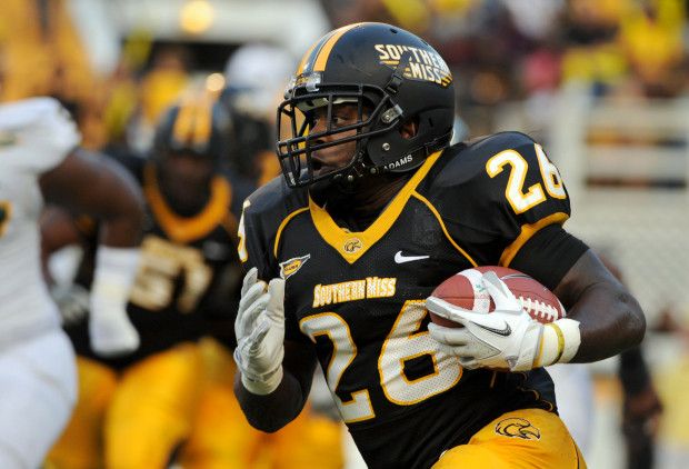
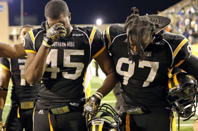
The most obvious and glaring thing is the lack of any real design here. First, what we have is a stock Gold adidas Tech-fit jersey that is out of date. We know it is out of date because of what designers call the “Shock Web” pattern that you can see all over it. This, in itself, is a bad element worthy of killing even the best designs that have to be placed on it. For those who need further clarification, the “Shock Web” was actually dropped by the schools in partnership with adidas that most would consider as major market schools (think A&M, even Mississippi State) in favor of a new, Shock Web-less template.
Now, I have had some fans on Twitter come at me with the argument that this looks good because it’s a “traditional” looking uniform. I like traditional looking uniforms. I really do, but everyone has their own traditions. Yes, this type of concept is good for Alabama, Oklahoma, Georgia, Penn State, the blue bloods of the game. They have the tradition (a lot of it), and guess what, they never changed it. (which is the real reason why it works still!) It was established as their unchanging uniform, therefore it became traditional. No offense Southern Miss, I know you played them for a long time and competed well with them on the field sometimes, but you ain’t Alabama. This super simple uniform doesn’t work for you. Not when you’ve gone through the cookie cutter progressions that you have with uniforms over the last decade or so:
And they aren’t all bad either! I’m just saying we can’t call this uniform “traditional” when it’s not showcasing anything traditional, so knock that off. But we can call it what it is. Lazy design. Whoever came up with that has got it figured out though by somehow pushing that through. They made a bunch of money rolling that out when I promise it took like five minutes to come up with. It’s a high school uniform! Don’t believe me, let me show you.
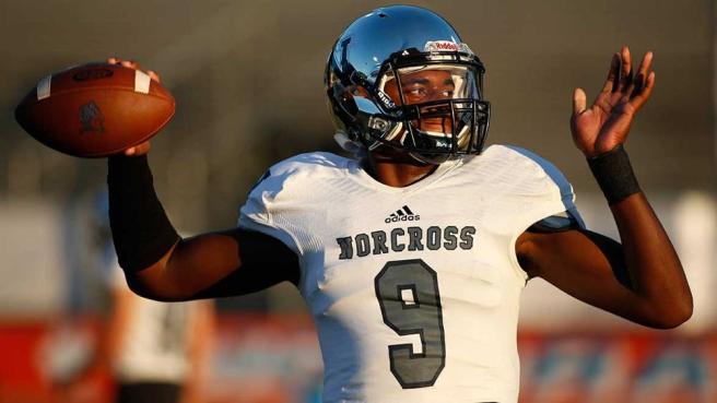
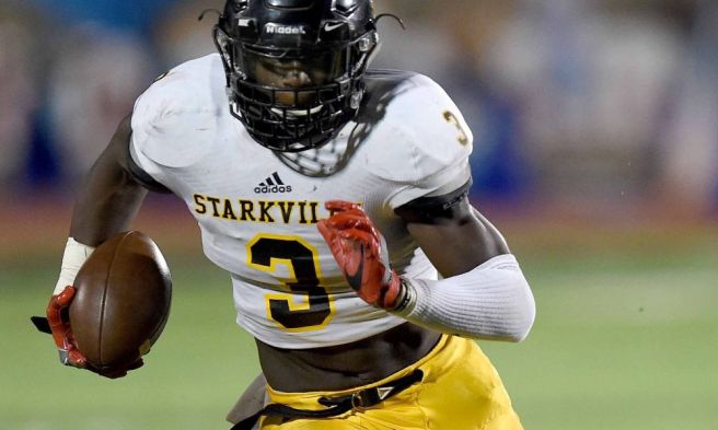
I think these pictures of HIGH SCHOOL UNIFORMS do all the talking that my point needs. So no, it’s not traditional. Call it what it is, lazy. Someone got off with making a high school knockoff for your D-1 college football team, and personally I’m offended. Southern Miss has a lot of potential with their font and actual uniform history to pull from. Embrace your cookie cutter past! That’s what design is! Reps get paid to go to campuses across the country and look at the culture and the history of the programs and design a uniform based on that. You can not tell me that is what happened here, but it should have. And that is my problem with them.
So here, I’ll do it for you! And I’ll even explain why I did some of the things I did. Adidas, if you want to use these in the future, let me know! We can work something out! I know the players like mine better already, I asked some of them who are currently on the team that I coached in high school this morning.
Let’s get to the why first. As I said, Southern Miss has a lot of potential for great uniforms. Great colors (no, even though I am an Ole Miss alum, I do not think those are God’s only chosen colors to look good on this earth, come on now), great history, though it may be somewhat piping, pattern, and stripe friendly, and a tradition that is strong enough to be the foundation (while still not trying to be knock-off Alabama).
So I took this:
and this:
and this:
and this:
and finally this:
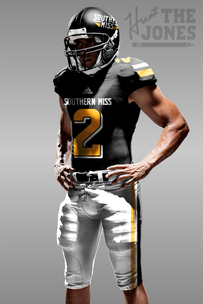
To make these:
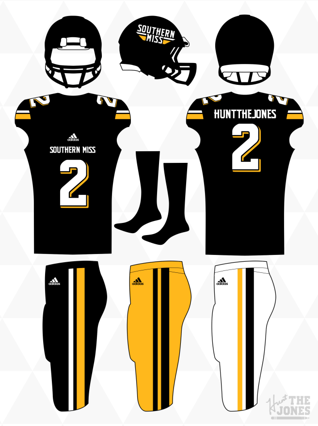
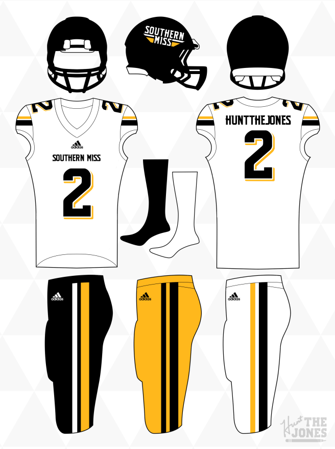
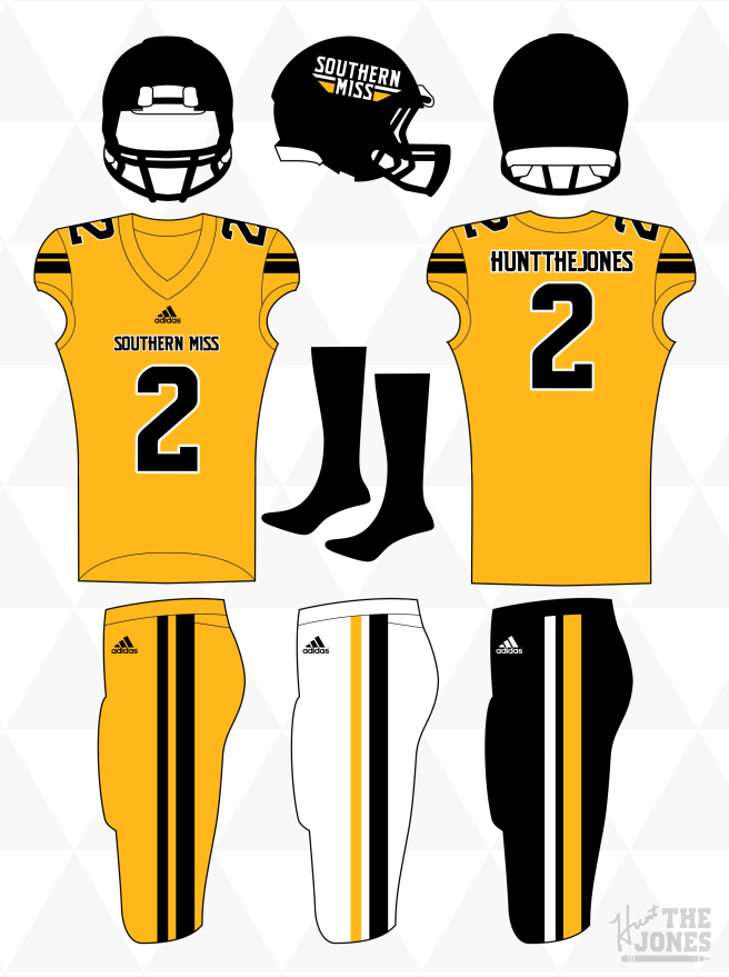
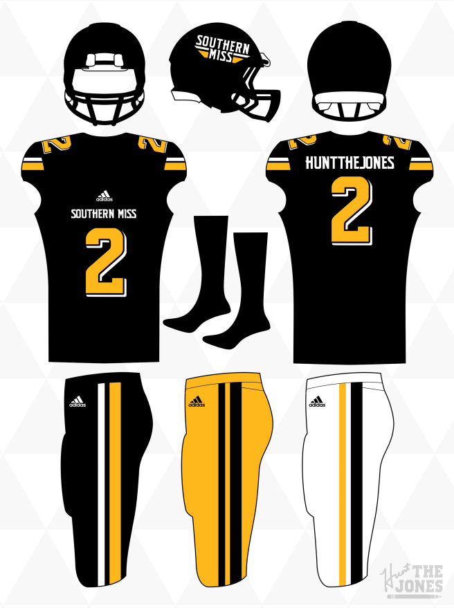
Now let me explain them. Let’s go top to bottom. Throughout the entire design, you will find that the lack of direct outlines around numbers and word mark help give it a clean, modern traditionalistic feel with the Black and White tops/bottoms, while the Gold top and bottom reflect the more modern style of the late 2000’s – Early 2010’s.
- The Helmet – Nothing really outlandish here. We have our typical all black shell and mask and drop all of the striping on the helmet (because there is striping in the logo). So about the logo. Love the helmet logo, and extremely glad to see it make a comeback in the current set. What I did to modernize it somewhat, was take away the three stripe design by meshing the bottom two into one thick stripe to give us a striping pattern that alludes to the drop shadow numbering and now permeates throughout the entire concept.
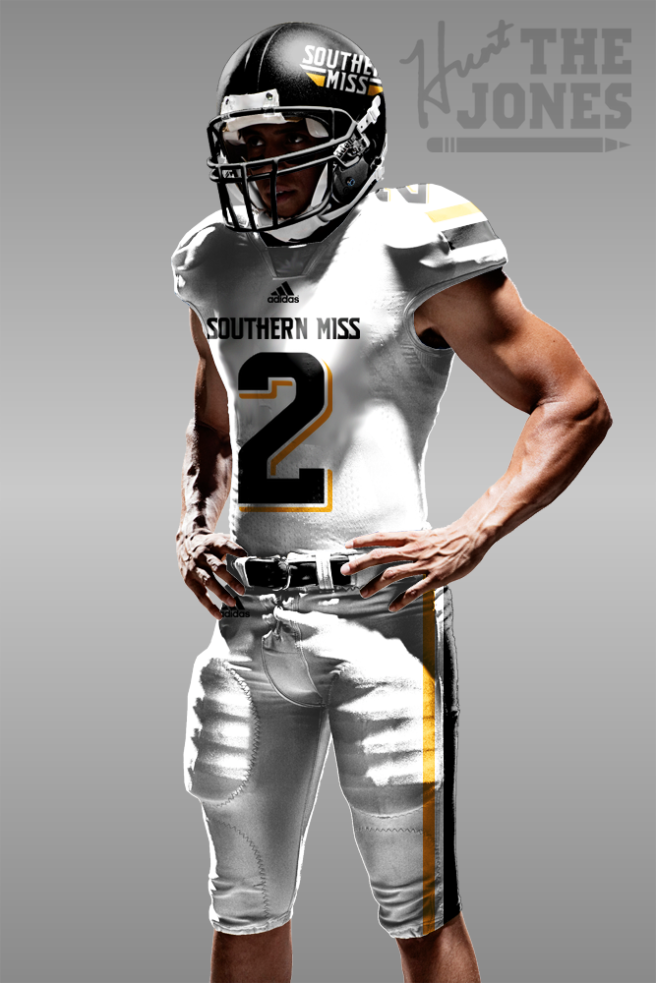
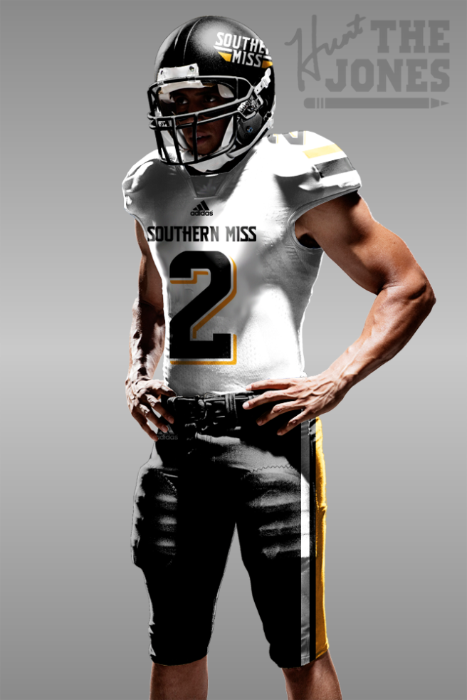
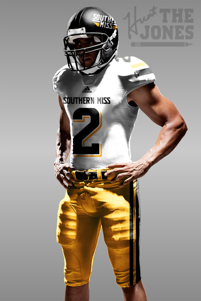
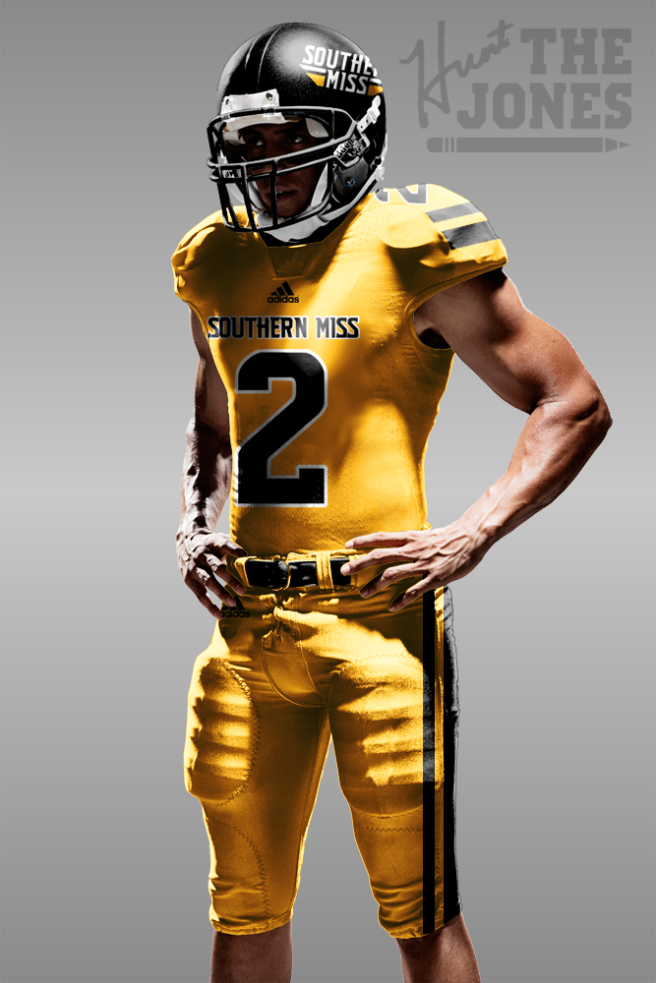
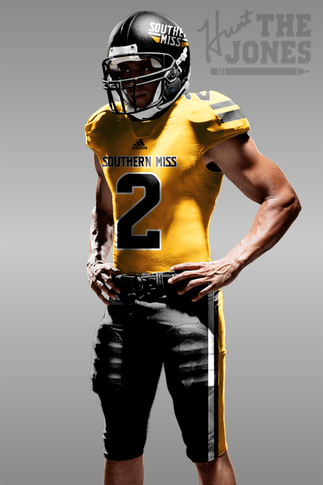
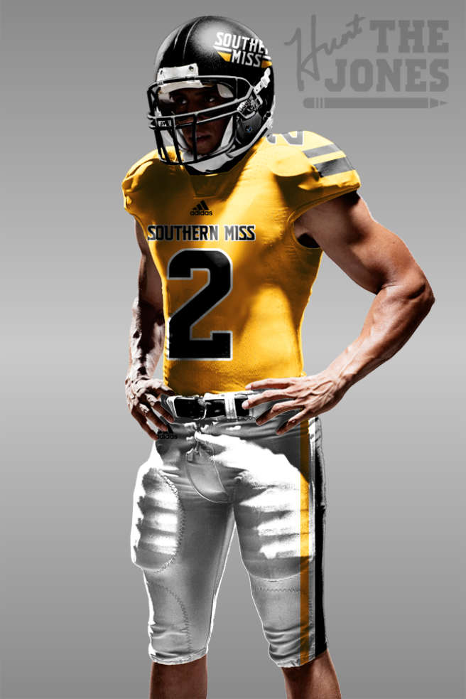
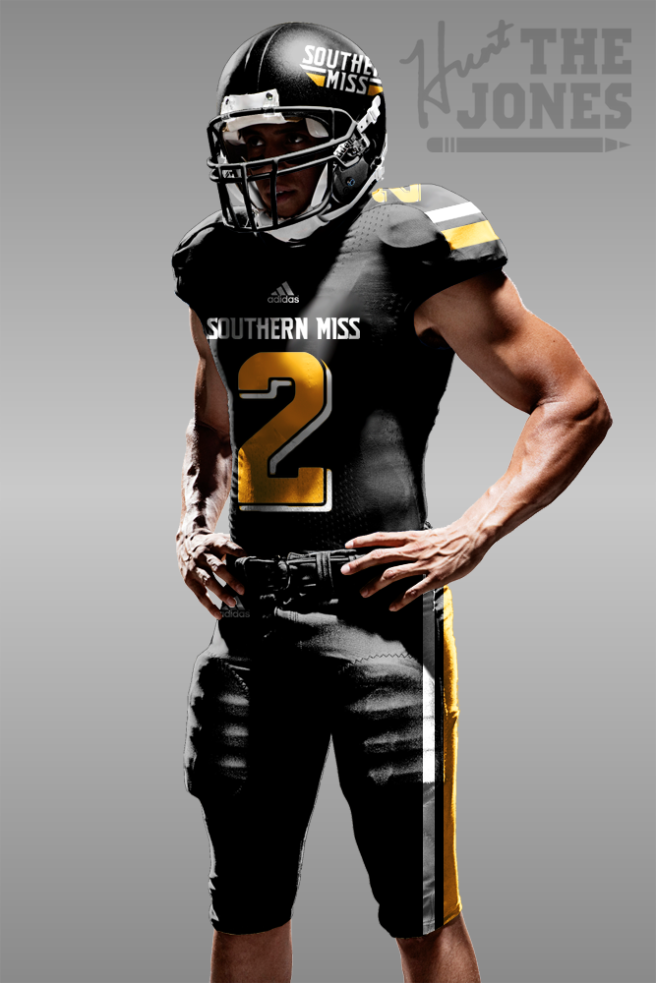
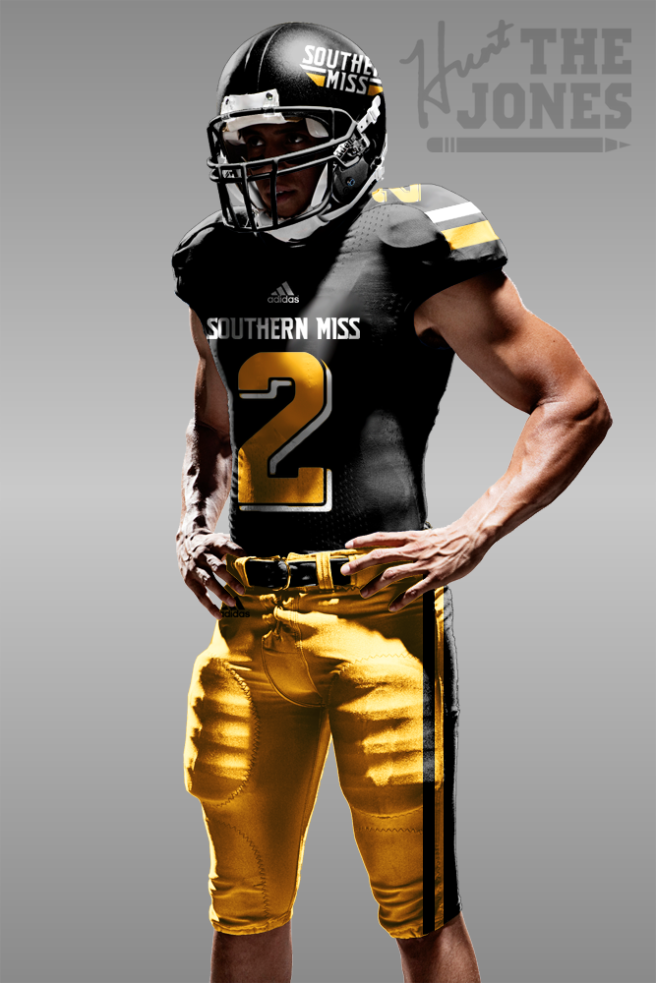
- The Jersey(s) – I don’t want to hear any, “these are plain just like the ones you don’t like now, blah blah blah…” because they are not. They, paired with the consistent striping of the entire uniform, stylized word marks and numbers, are tastefully traditional, while not trying to go down that Alabama road while still staying away from the high school catalogue look. The numbers and word mark are the Southern Miss specific font of the late 2000’s – Today giving us the modernized feel, while adding the drop shadow of the early 2000’s gives that traditional feel ya’ll want an extra boost. Like the throwback uniforms from 2017, we see a sleeve stripe, the same one from the helmet and pants, on each design (all keeping with the same style as the drop shadow).
I know I have two black jersey’s on there, and truthfully it’s because I couldn’t decide which one I liked better. I have no other reason really, so you pick one.
- The Pants – Same song. Regular three school color pants, with the striping continuing on through the bottom half of the uniform.
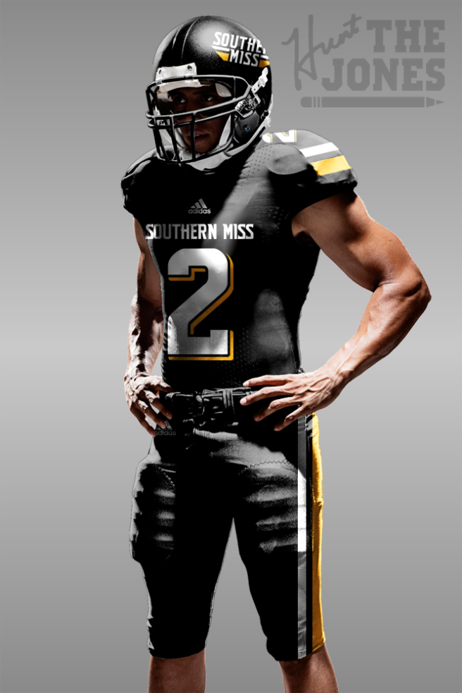
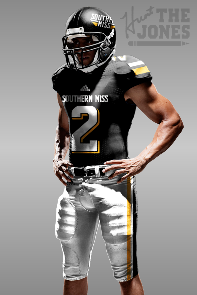
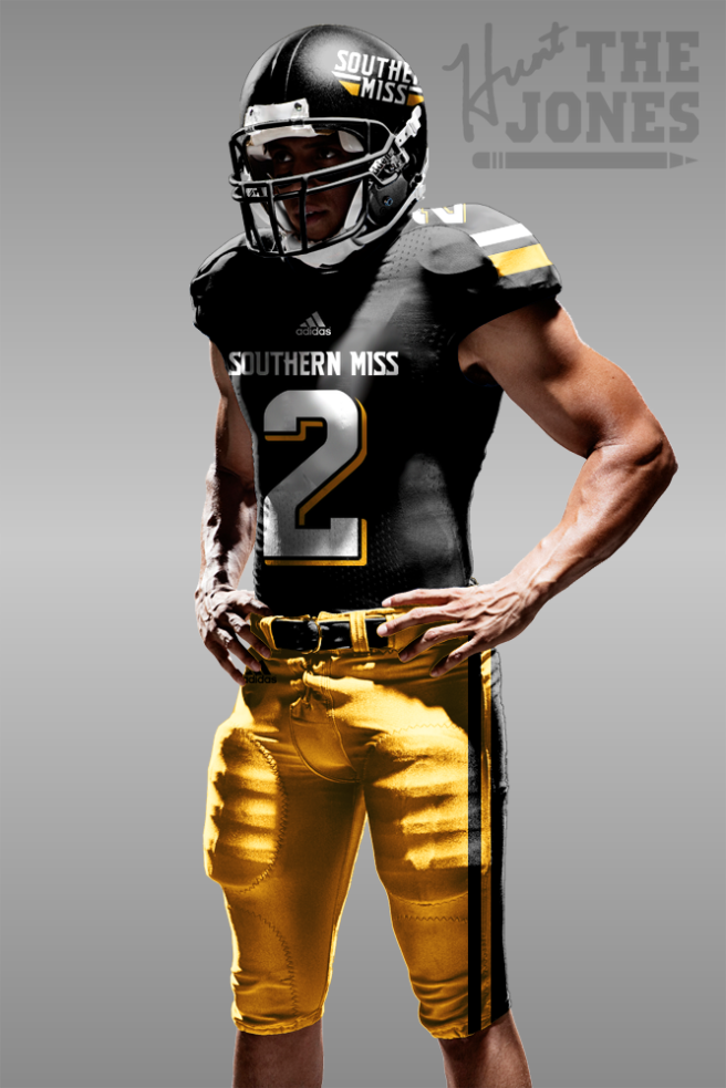
Here’s a rough, realistic adidas template with the concept, just incase you’re still having trouble visualizing (Get ready to scroll, there are quite a few to show all of the different jersey/pants combinations):
That’s that. You’re welcome Southern Miss, for helping you come up with something better for next year, even if I do only come up with “bad logos & worse type choices.” Adidas, I’ll be open to hearing offers for a contract.
Like I said, this was fun. The criticism really inspired me to come up with something (And it only took me like 2 hours! Imagine being on a campus for months and studying up and working on designs with people inside the program and University, and getting paid for it!) that I have been meaning to do for a while. So, as one of my Southern Miss Twitter warriors once said, “You don’t think this uni looks good I don’t know what to tell you. Looks great to me.”

Looks great!! Hunt the Jones
LikeLike